news
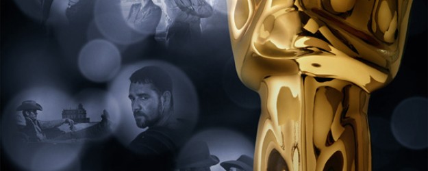
84th Academy Awards Poster – A few steps on the way to the finish
 Posted on February 17, 2012
 by admin
  0
0
The development of my poster for the 84th Academy Awards poster,
from the first comps prior to the photo shot of the statue to the final poster and few other rough concepts of mine.
The first 3 show the development of the light bubble poster -
starting with the finish to the third poster which is the first one presented.
Continue Reading »
Continue Reading »
Naked Hollywood Show at MOCA part of Getty’s “Pacific Standard Time”
 Posted on November 7, 2011
 by admin
  1
1
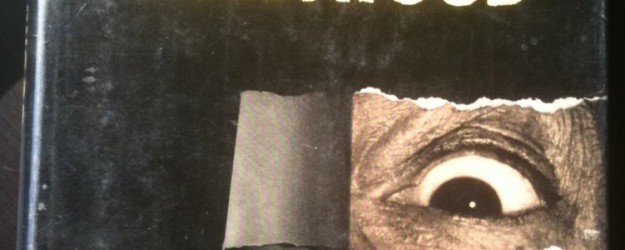
Next Sunday at MOCA there is a show of Weegee photographs from his work done in Hollywood - "Naked Hollywood" plus 200 of his photos from the period never scene before!
I've included a shot of my original copy of the book, as well as, a scan of one of the two clippings of his obituary that I found in the book when I bought it.
Take notice of his quote in third to the last paragraph - "I like things to be normal. A good fire or a murder every few nights. It's natural for a woman to shoot her husband and a guy to throw his sweetheart over a cliff. I hate suppressed desires"
http://www.pacificstandardtime.org/exhibitions?id=naked-hollywood-weegee-in-los-angeles
Continue Reading »
Continue Reading »
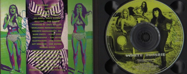
I contacted Mister Meyer and asked if we could use some shots from "Faster Pussycat, Kill, Kill" for a project i was working on - the digi-pak single of "Thunderkiss '65".
He said I could and made an appointment for me to come over and look at the contact sheets of the unit photography. I was thrilled! His house was in the Hollywood Hills
between Lake Hollywood and the Hollywood sign. It was a 50s ranch style house with no landscaping - white decorative rock covered the flowerbeds.
It looked like a house in Phoenix, AZ. He answered the door wearing boxer shorts, black socks, an A shirt...
Continue Reading »
Continue Reading »
Just found this old color xerox of me holding a rubber chicken to which I added the Jackyl logo and a pierced beak ring (ala the Aerosmith Get a Grip brand).It was a prop to be used on a Rip Magazine cover shoot with Jackyl's Jesse James Dupree which is also included in this post. I first sketched the Jackyl logo seventeen years ago on a cocktail napkin and they are still using it today. Jesse is a regular on TRU tv's Full Throttle Saloon where I have seen the logo on the air last season and the band is still playing. Rock on, Jesse!
I will post the cocktail napkin when I run across it.
Continue Reading »
Continue Reading »
My finished design for the Something Borrowed Home Entertainment Poster and DVD cover
Continue Reading »
Continue Reading »
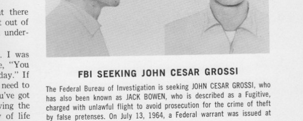
An old issue of Communication Arts that I had dated Sept/Oct 1965 has a small sidebar story published at the request of the FBI looking for a con man armed robber that did commercial art as a day job.
Continue Reading »
Continue Reading »
My finished poster design for the film THRIVE.
A documentary about what we can do to make the world a better place to live.
http://thrivemovement.com/
Continue Reading »
Continue Reading »
A few years back or so I met Esther Weidemann, the daughter of world renowned typographer and designer Kurt Weidemann, while crashing the pool at The Mondrian. Weidemann is probably most famous for designing the typeface ITC Weidemann which, as Esther told me, was commissioned for the publication of a Bible that saved paper. So the typeface is classic in its' basic design and style but more condensed than say Bembo or Garamond. He also redesigned the Porsche Logo. Not really the Paul Rand of Germany but close. Below are a couple of links about him.
Continue Reading »
Continue Reading »
In this section, I will post various things concerning design, music, movies and record collecting that i find interesting. as well as my recent finished work and some old stuff from my archives.
Continue Reading »
Continue Reading »
Michael Golob Design

